| Site Effectiveness Tips |
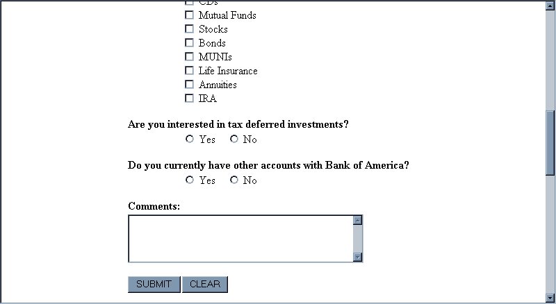
| Use easy-to-understand, unequivocal language; avoid
"technospeak" Web designers tend to use technical terms; make sure your Web site uses language that its users will understand. And make sure users can anticipate the result of clicking on a link. For example, the form below, from Bank of America’s Web site, has a button marked "Submit." Users would more easily understand a button marked "Continue," or "Click here to submit your request." Also, it is a bad idea to put a "Clear" button next to the "Submit" button. Users might click it by mistake and unintentionally erase all of their input. Usually, a "Clear" button is unnecessary. If sites still want to include one, it should be placed far from the "Continue" button and should be labeled more explicitly (e.g., "Erase My Entries on This Form"). |